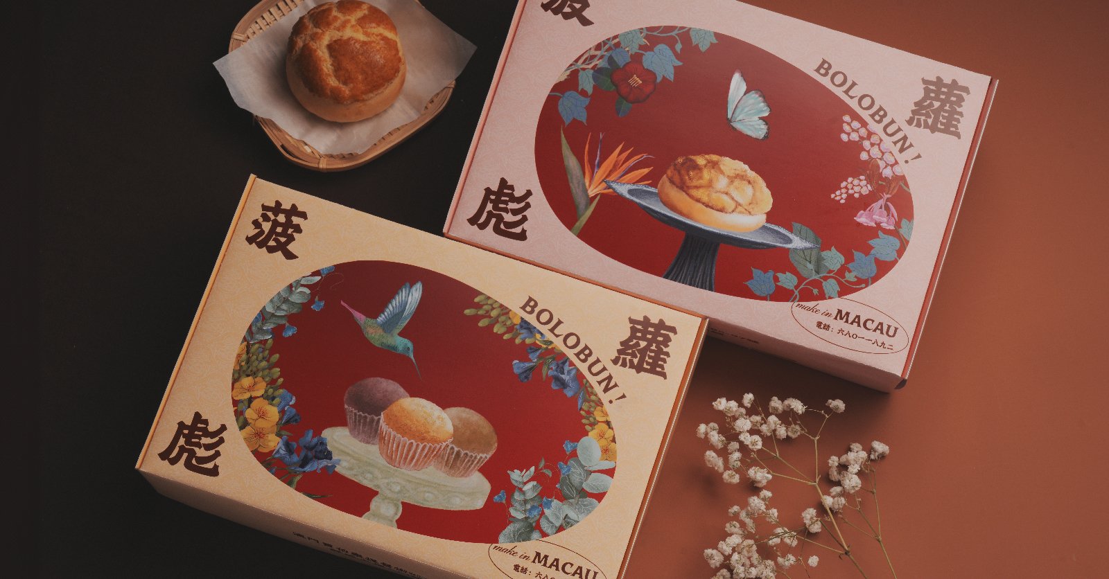
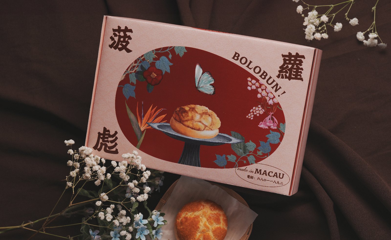
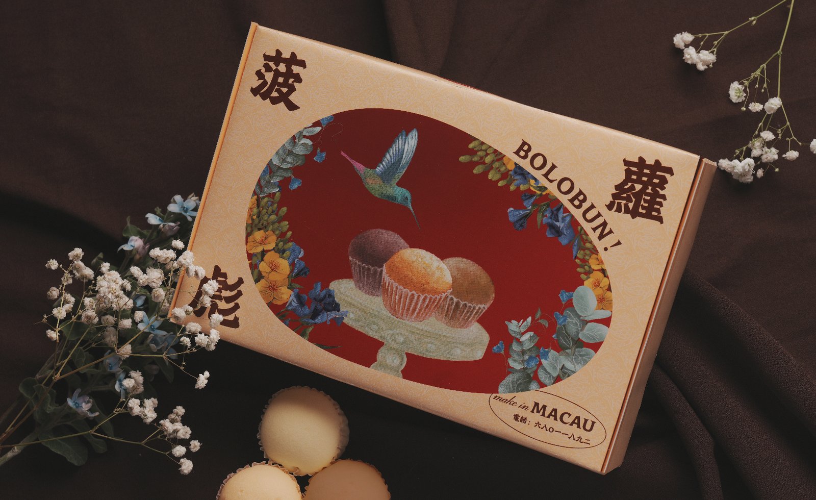
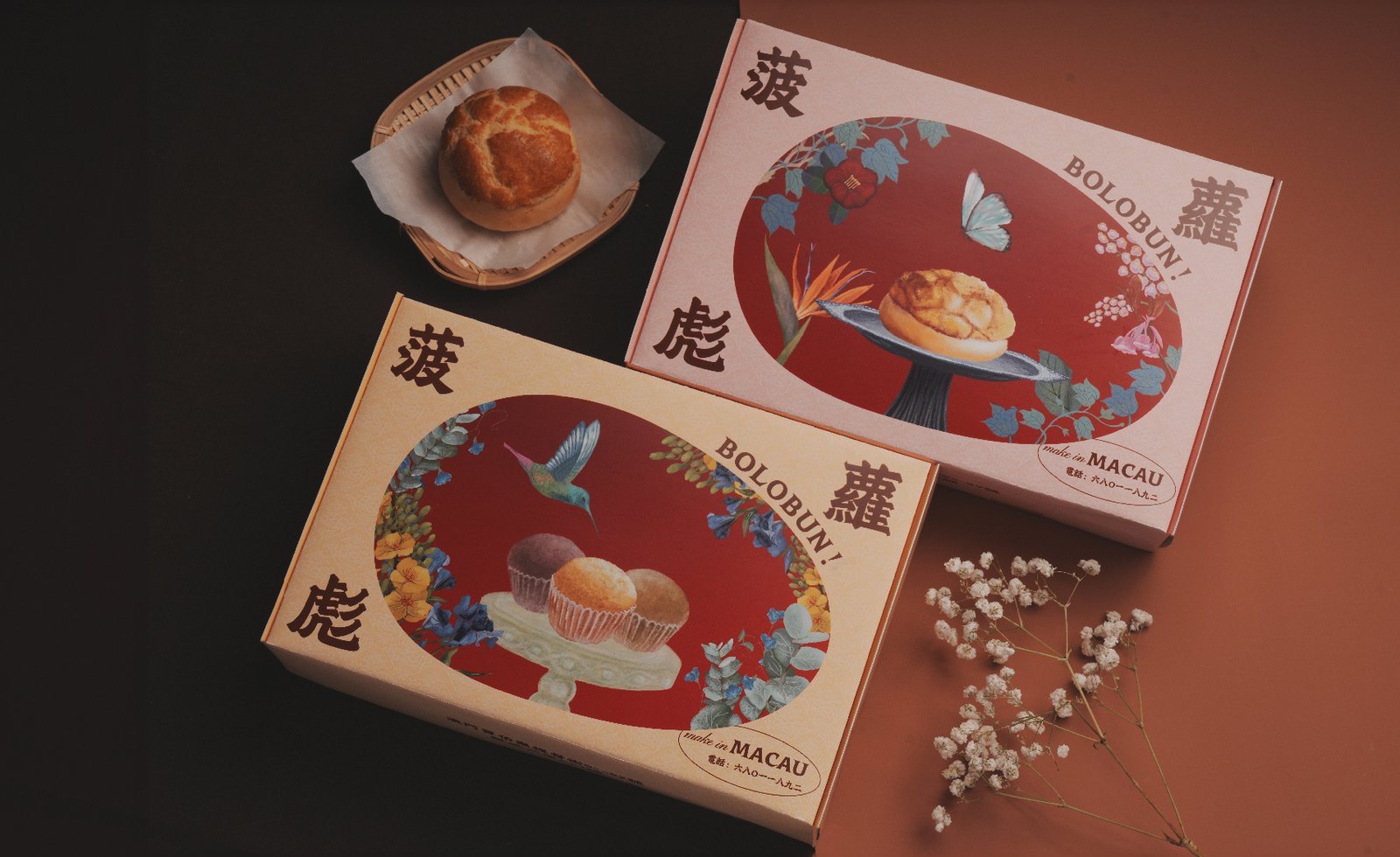
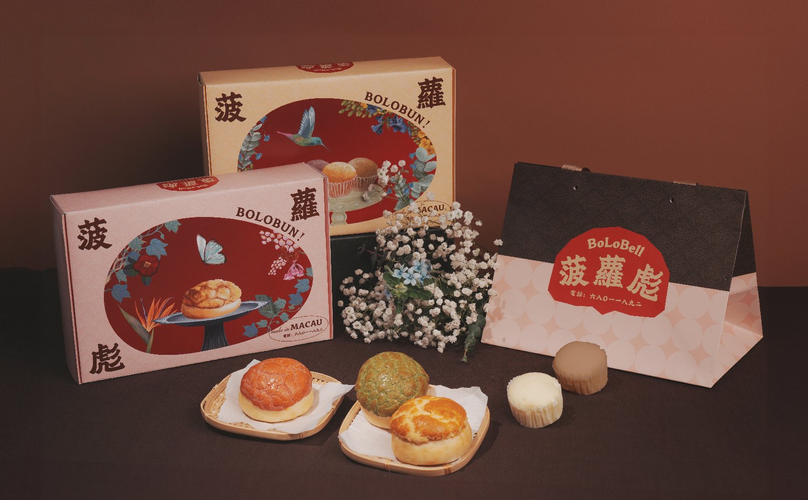
菠蘿彪是一間以菠蘿包為主打的麵包店。他們保留了菠蘿包「裹著一層酥皮麵包」的原始模樣,在此基礎上重新定義菠蘿包。將「金黃且凹凸不平」的表面創新成完全不同顏色、內含融入多種風味食材的菠蘿包,例如泰式奶茶、抹茶柚子、咖啡雞尾等非同一般的口味,為澳門街坊們帶來新式菠蘿包的味蕾記憶。
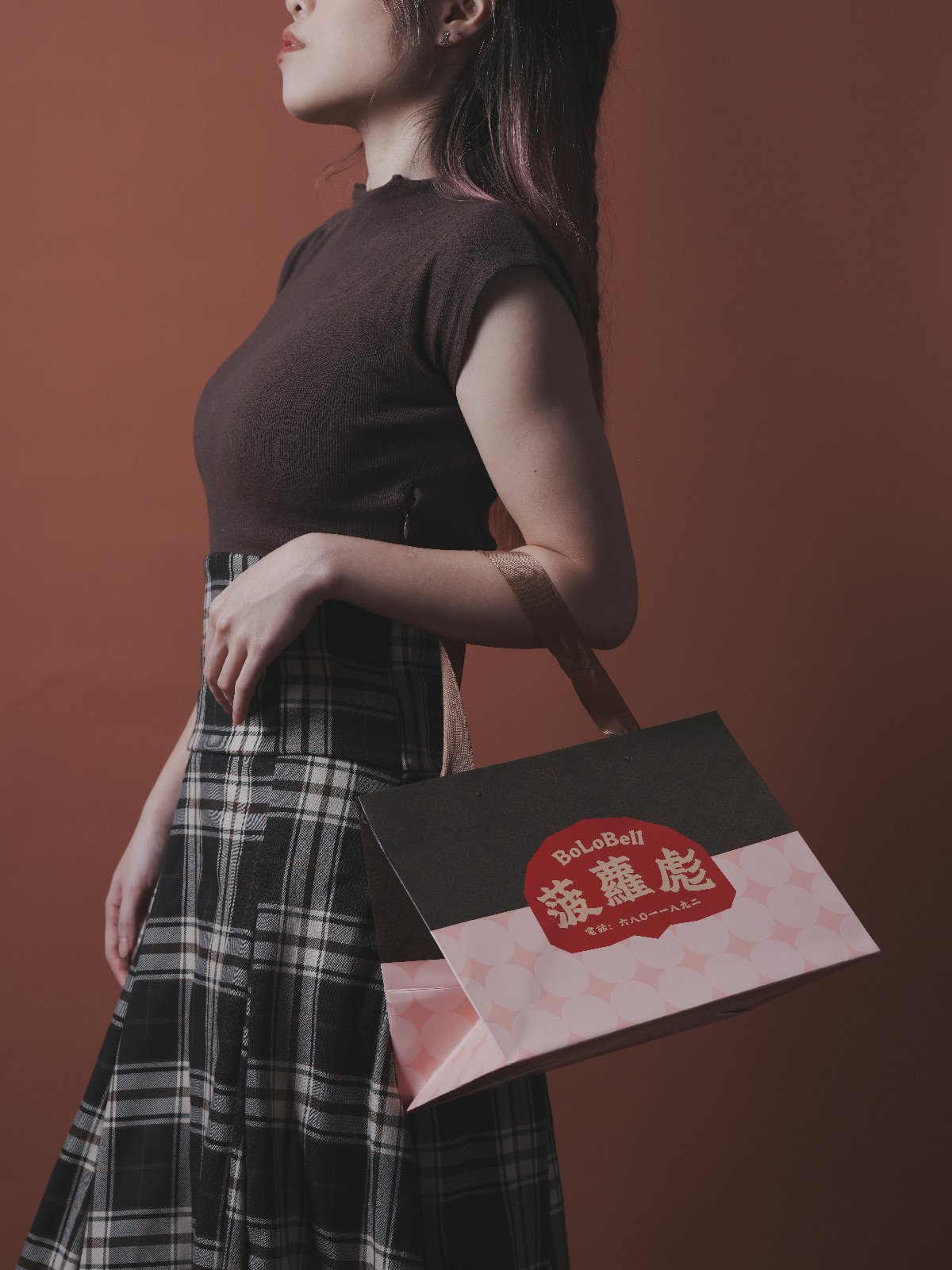
我們運用粉色系作為設計包裝的主打顏色,與「菠蘿彪」這一略顯粗獷、極具港式風格的品牌名稱形成強烈反差,深化其「延續、創新」的品牌理念。為了區別當下趨於隱晦的設計風格,我們更傾向運用具象的設計元素,來表達對傳統文化的理解。不僅有別於市面上泛濫的港式設計風格,更能讓大眾直觀的辨別出品牌销售的產品特色,將菠蘿彪對於港式菠蘿包傳承的尊重和風味上用心的研發面面俱到。
BoLoBell is a bakery specializing in pineapple buns.They have redefined the pineapple bun by keeping the original shape of "wrapped in a layer of puff pastry".The "golden and bumpy" surface of the pineapple buns has been innovated into a completely different color, and the pineapple buns are filled with a variety of ingredients, such as Thai milk tea, matcha pomelo, coffee cocktail, and other extraordinary flavors, which bring new pineapple buns to the taste buds of the residents of Macao.
We used pink as the main color of the packaging, which is a strong contrast to the slightly bold, Hong Kong-style brand name "BoLoBell", deepening its brand concept of "continuity and innovation".In order to differentiate ourselves from contemporary design styles that tend to be more subtle, we prefer to utilize figurative design elements to express our understanding of traditional culture.It is not only different from the Hong Kong-style design that is widely available in the market, but also allows the public to recognize the characteristics of the products sold by the brand in an intuitive way, which shows BoLoBell's respect for the heritage of Hong Kong-style pineapple buns and its dedication to the research and development of flavors.


瀏覽更多作品