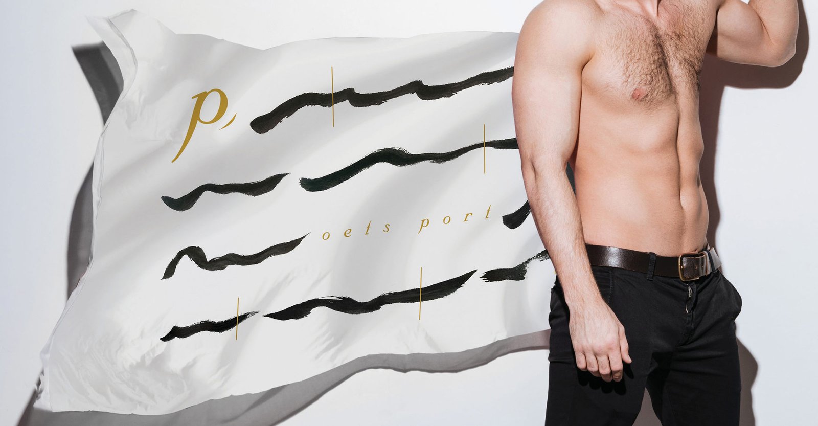
poets port是澳門本音樂制作機構,旨在與不同領域的音樂人 共同合作,把澳門人創作的詩與音樂互相結合。詩和音樂都帶著一份 隨意及律動感,故標誌設計則以一首抽象的詩作為橫線, 金色富節奏而纖細的直線則代表音樂,兩種元素 交織出每份屬於澳門人的本土創作。
"Poets port" is a Macau local band which works with musicians in different fields of music. Their passion is to create original sound by blending, incorporating Macanese poems into their recording.
As poems and music have their own rhythms, the logo was inspired to bring the two elements in their logo design, in which, a horizontal line represent an abstract poem while the golden thin vertical line with rhythm represents the music, making a creation intertwined by those two elements.


瀏覽更多作品